Towards the beginning of the semester, Dr. Joe Cope began our class period by passing out small pieces of fairly thick paper, and told us we should use them to create art cards. More formally known as artist trading cards (ATCs), this project helps us to realize the significance of creativity and the way we can use it to relate to and understand each other on a deeper level.
Dr. Cope told us that he exchanges ATCs with people all around the world—it’s kind of like having an unlimited number of pen pals, but in a different form of art full of expression! He passed around a binder full of the ones he’s collected so far, and each one is wonderfully engaging. I noticed he had a bit of an organizational scheme going, separating the black and white from those bursting with color, and grouping together cartoon characters, for example. The sheer variety and range of art cards Dr. Cope has is astounding, and it made me wonder at the motivations and artistic images behind each and every work. For me personally, the most special, significant part of hearing about Dr. Cope’s exchange of ATCs with people all around the world is the connection(s) that he has surely made with others, people with whom he might not have normally crossed paths otherwise, because of this hobby that has allowed him to forge new relationships.
Art cards emerged in part from the 20th century pop art movement which sought “to elevate popular culture to the level of fine art”. This movement was all about making the mundane meaningful, and it ties in nicely to one of the most prominent ideas in our course, one present in each blog post and in everything we have said, done, and learned so far. In order to make the quotidian significant, we must be especially mindful of everything put forth by both ourselves and others so that we can recognize when something is insensitive or does not align with the ideal image of a wholly equal society.
The majority of Dr. Cope’s lecture found us analyzing 17th-century woodcut illustrations entitled “Images of Ireland” by John Derrick. One image that especially stood out to me is included below.
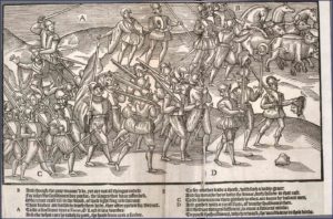
Each part of the image shows a different scene as men prepare for battle, but not everyone in the picture is necessarily aware of the actions of their comrades. The structure of the image leads us to first dissect the picture, and then interrogate our interpretation with the captions below. As demonstrated in the above work, a central theme we discussed in class is how words can be supplementary to pictures, just as they often are in Prince’s work.
Although Prince uses this technique in many of his pieces, one in particular comes to mind. Plate 5 of Prince’s Katrina Suite, entitled Second Line: Rebirth (which can be found at this link by scrolling a little over three quarters of the way to the bottom of the page) is a fully involved work incorporating many different parts of Prince’s own experiences and research into Hurricane Katrina. Viewers can see the words “Katrina’s Rebirth” on the left side of the image printed on the hat of one of the subjects of the piece. There are an abundance of symbols to focus on here: the dove, and why it is perhaps trapped or, contrarily, free from everything else in its lone box; the spikes on the inside of the middle musician’s trumpet; or the way that even the power lines are a symbol of God, resembling the Christian cross. The inclusion of the words “Katrina’s Rebirth” (where even the “t” in “Katrina” looks to be the lone lowercase letter, also in the shape of the cross) in the image magnify, rather than explain, the central message of the piece. I see it in the sense that “less is more”. To this end, maybe receiving just one tiny artist trading card from an equal across the world speaks several volumes more than anything someone could say in a letter.